Social Media Measurement for NGOs: The 5 Numbers Worth Tracking
When I ask organisations, almost all of them say they measure. Then we open the report and there is one number in it: follower count.
Follower count is not a measure, it is a stock. It tells you how many people once pressed "follow". It does not tell you how many saw you today, how many cared, or how many did something.
This article sets out the five numbers small teams should actually track, and which decision each one drives. All five can be collected with free tools in twenty minutes a month.
First, separate the three layers
Every measure falls into one of three layers. The confusion comes from showing all three in one table with equal weight.
| LayerWhat it showsExample | ||
| Reach | How many saw it | Impressions, reach, followers |
| Engagement | How many stopped | Likes, comments, saves, video watch time |
| Conversion | How many did something | Visited the site, subscribed, completed a form |
Reach can be bought. Engagement can be triggered. Conversion can only be produced by someone who genuinely cares. That is why the weight of your report should increase as you go down.
The five numbers
1. Visitors from social media to your website
Where to look: Google Analytics, traffic sources.
This is the only honest return on your social media effort. If you publish 40 posts a month and send 12 people to the site, the problem is not posting frequency but content type.
The decision it drives: which channel to drop. A channel that has sent you single-digit visitors for three months is not your channel.
2. Newsletter subscribers and growth rate
Your social media account does not belong to you. When the algorithm changes your reach drops; if the account closes, the list is gone. An email list is yours.
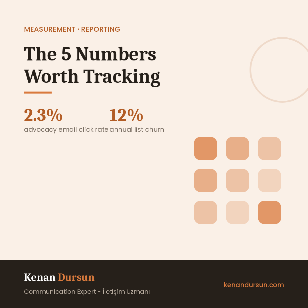
M+R's 2026 Benchmarks report is a useful anchor: nonprofit email lists grow by an average of 5% a year against a 12% annual unsubscribe rate. In other words, if you do nothing, your list shrinks.
The decision it drives: where subscriber collection sits in your workflow. If there is no subscribe call at the end of every article, event and form, the list will not grow.
3. Newsletter click-through rate
Open rate is no longer a reliable measure; email clients preload images and inflate it. Click-through rate shows real interest.
Per M+R's 2026 data, the average click-through rate is 2.3% for advocacy emails and 0.59% for fundraising emails. Advocacy calls get clicked roughly four times more than donation asks, which is a serious hint about what to lead your newsletter with.
The decision it drives: your subject line and where the first link sits. When clicks are low, the problem is usually not the content but the call being buried too far down.
4. Number of people who completed a form
Application forms, contact forms, event registrations. This number is where communication turns into institutional work.
Do not only look at the total, look at where it came from. If 22 of 30 form completions came from the newsletter, you should be shifting effort from social media into newsletter content.
The decision it drives: where the effort goes. If this number is not rising, you gain nothing even if the other four are.
5. Saves and shares
Likes are cheap, saves are expensive. Someone who saves a post is saying "I will come back to this". Someone who shares it is lending you their own reputation.
Instagram and LinkedIn both report these. On small accounts they are a far better quality signal than likes.
The decision it drives: which content type to multiply. Your strength is not the post with the most likes; it is the post that gets saved most.
A twenty-minute monthly routine
Do this on the first working day of the month, write it in a table, and stop.
- Open Google Analytics and note visitors from social media (3 minutes)
- Take the subscriber count and last send's click rate from your email tool (5 minutes)
- Count form submissions and check where they came from (5 minutes)
- Note the three most-saved posts of the month on Instagram and LinkedIn (5 minutes)
- Write one sentence: "The thing that worked best this month was ..., and next month we will do more of it." (2 minutes)
Step five matters most. Measurement that does not produce a decision is just data collection.
What to put in a donor report, and what to leave out
Include: conversion numbers, before and after comparisons, an example of the content that worked best, and the lesson from something that did not work.
Leave out: follower counts, impressions, and groundless percentages like "our reach grew 300%". An experienced reader knows that when a percentage is given without an absolute number, the number is small.
Reporting that an experiment failed is not a weakness. Speaking as an evaluator: an organisation that reports its own mistakes reads as more credible than one where everything went perfectly.
This week
- If Google Analytics is not installed, install it this week. Setup takes an hour; the benefit lasts years.
- Look at social media referrals for the past three months, split by channel. The surprise is there.
- Remove follower count from your report and put form submissions and subscribers in its place.
- Open a table for the five numbers and fill in the first row today. Comparison only starts in month two.
Sources
- M+R, Benchmarks 2026, nonprofit digital performance based on 2025 data
- M+R, Email Messaging section, click-through and list data
- DataReportal, Digital 2026: Turkey
If you would like to review your measurement setup together, get in touch.
Join my WhatsApp community where we discuss civil society and communications.
Join the Community